We're evolving to meet the needs of our global community.
Our rebrand reflects this growth, but our mission stays the same: better financial services for all.
Join us in exploring the "why" behind our new look.

Our first logo was a simple 'W' and the word 'Weave.' It was a start but didn't capture our full identity as WeavePay.
The old design made our message unclear, confusing both clients and us.
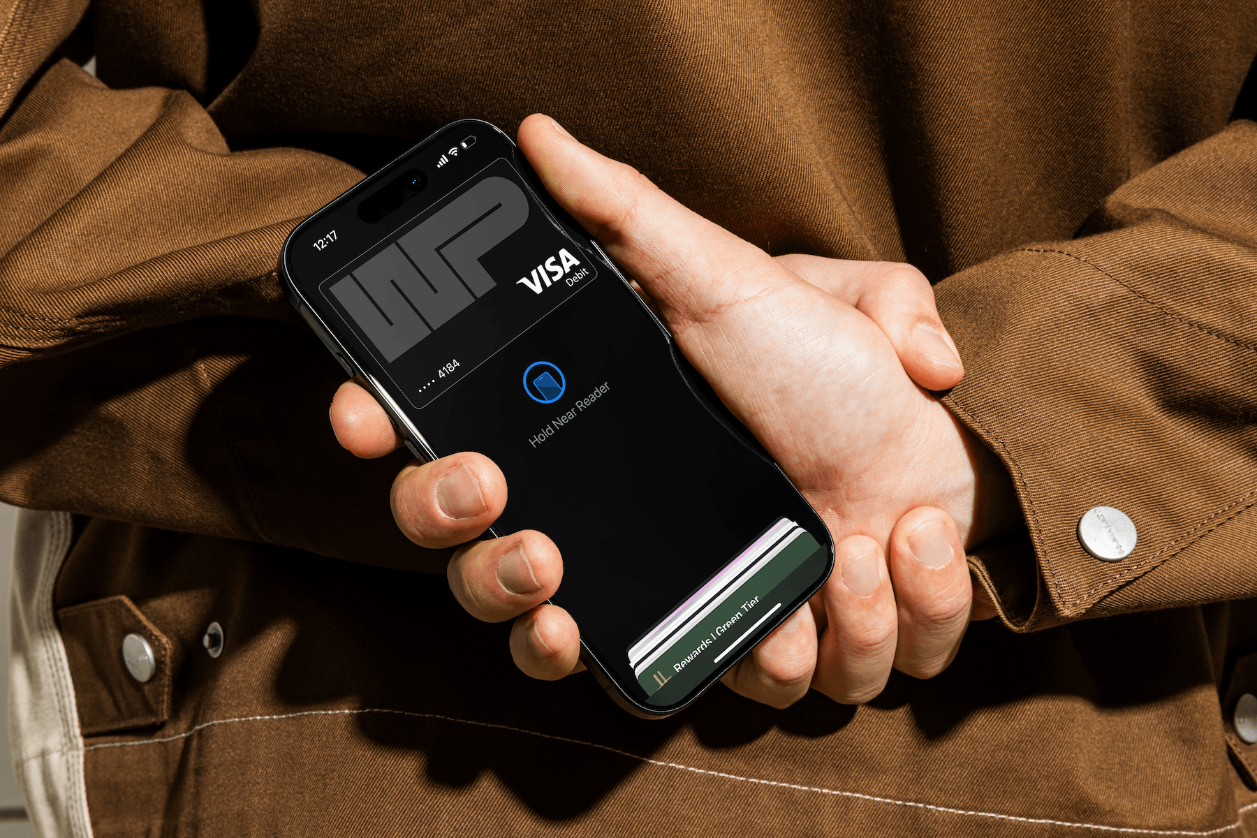
Our new logo, 'WP WeavePay,' is not just a visual change. It aligns with our legal name and clarifies our brand.
Our brand's growth led to a digital makeover, focusing on user experience.
1. Color Palette Overhaul: We shifted our colors from purple, gold, and green to a classic black-and-white palette.
2. Streamlined User Interface: With a black backdrop and contrasting white elements, we've created a clear, focused journey for every user. Every feature and button is strategically placed to make navigation easy and engagement natural.
You, our community, are the guiding force behind every decision we make.
As we step into this new chapter, your trust drives us to aim higher.
Thank you for being a crucial part of our journey.
Our dedication to empowering you remains unshakable.
"This rebrand underscores two pillars: functionality and simplicity. We let our technology take center stage by stripping away the bright colors. It's this technology that we're committed to refining and advancing." - Girts Straujums, CEO @ WeavePay
.svg)
Subscribe for special offers and news